In this post, we have summarized and slightly modified key topics from the book Fundamentals of Graphic Design to provide a simple and accessible introduction to logo design for all graphic design enthusiasts. We hope you find it useful! If you enjoy this type of content, please share your thoughts and feedback with us.
Logo design training
1. Position Heavy Elements at the Bottom
To create visual stability, avoid placing heavy elements at the top of the frame. This can create a sense of imbalance and instability, making it seem as if the element is falling.
The lower sections of a composition typically have more visual weight than the upper sections, shifting the center of visual gravity slightly below the mathematical center. In graphic design, this principle helps ensure a balanced composition.

Logo design training (How to design a logo?)
2. Effective Use of Diagonal Lines
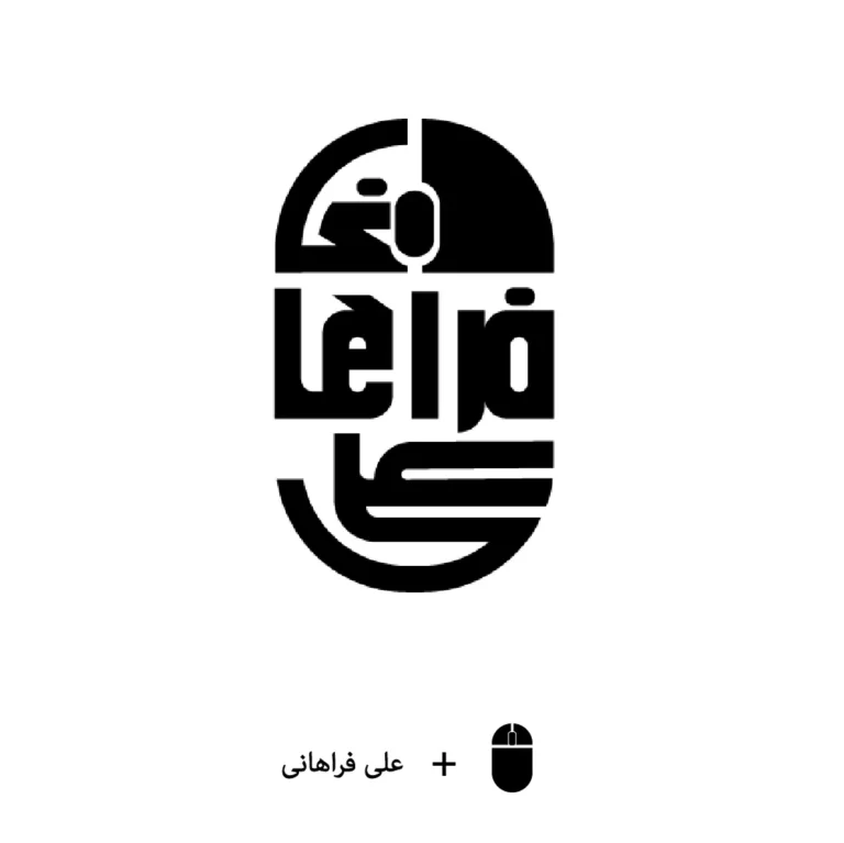
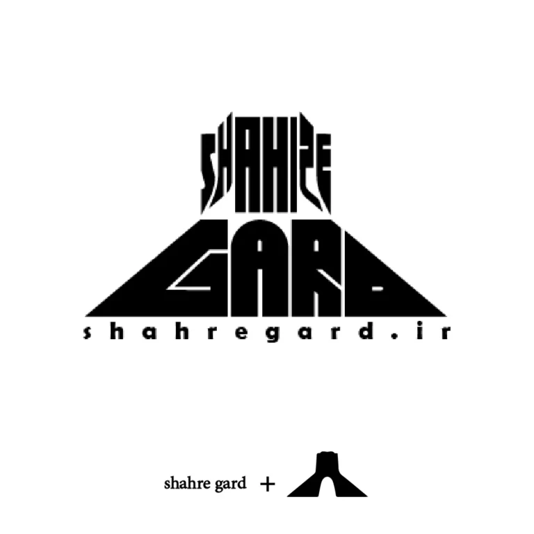
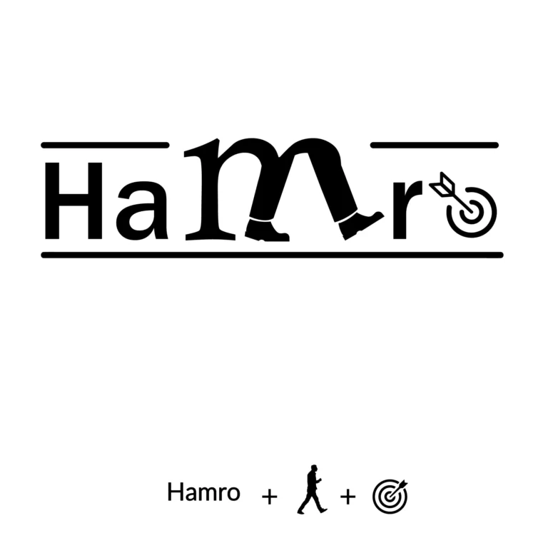
Diagonal lines are considered dynamic because they appear unstable and seem to be in motion, striving for vertical or horizontal stability. Modern design often incorporates diagonal elements as a way to break away from the rigidity of right angles in architecture and signage.
Diagonal compositions can create a sense of tension, which can be used strategically to engage the viewer. This effect can be achieved by placing a simple shape or an entire composition at an angle, surprising and capturing the audience’s attention.




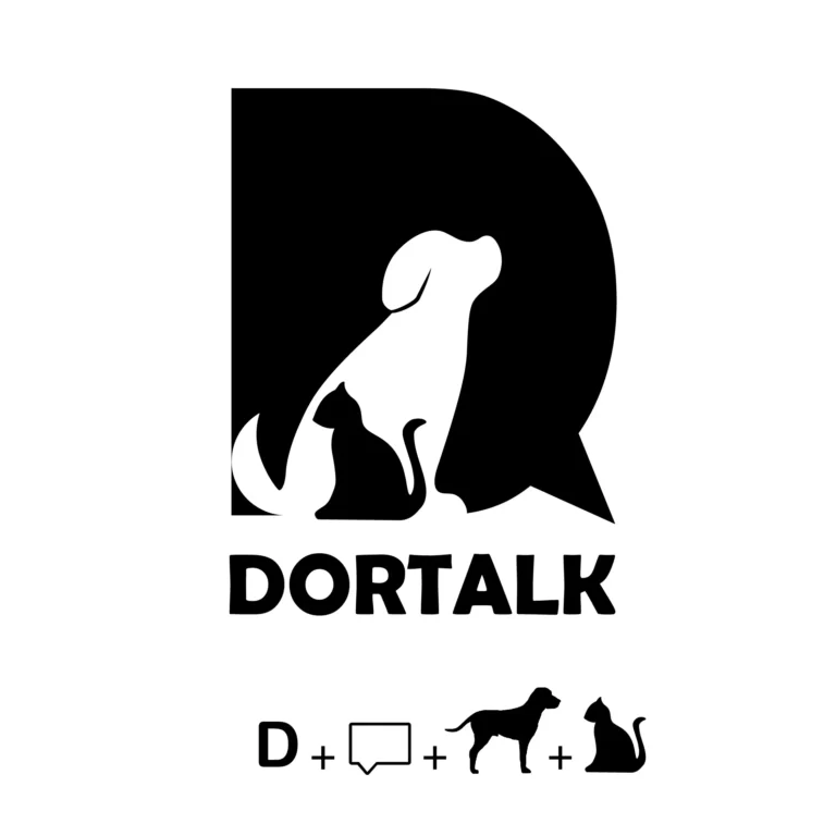
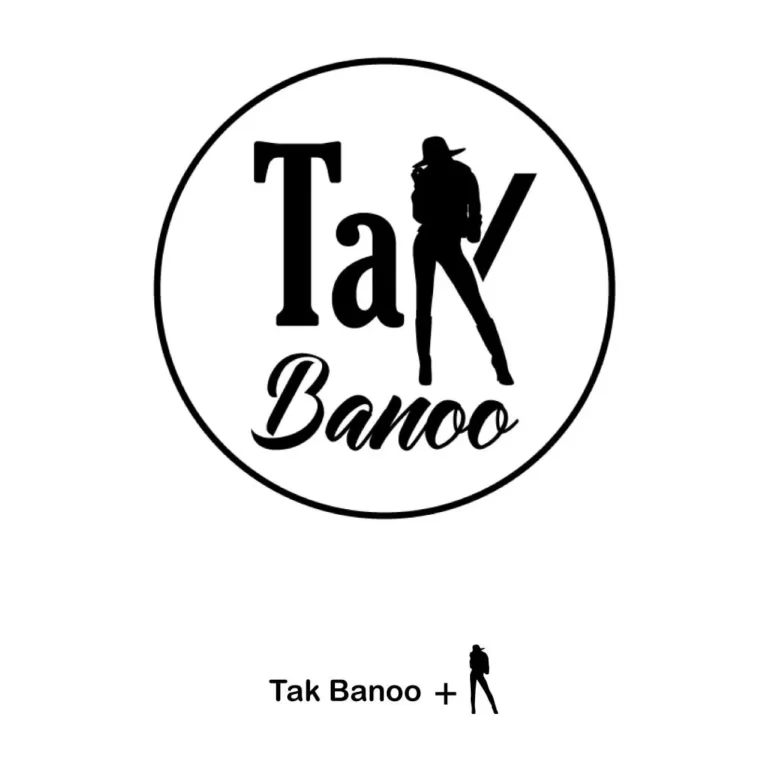

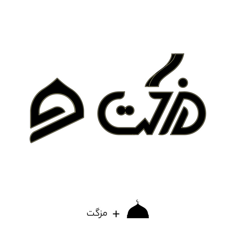


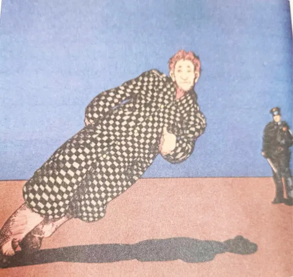
Logo design training (How to design a logo?)
♥ Visit this page to view samples of logos designed by Wink Design and place an order♥
3. Guiding the Viewer’s Visual Path
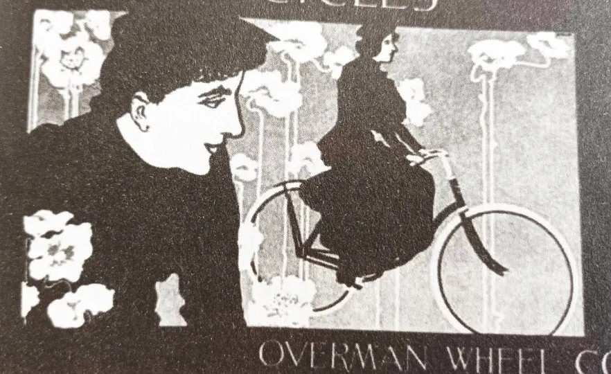
The left side of a composition is generally more dominant because the eye naturally moves to it first. Visual movement from left to right requires less effort than right-to-left movement. For example, an animal moving from right to left appears to be pushing against more resistance than one moving from left to right.
Therefore, the most important elements in a logo or graphic design should be placed on the left side. If an element has directionality, it should ideally point to the right, guiding the viewer’s gaze smoothly across the composition.
Logo design training (How to design a logo?)
4. Achieving Balance and Symmetry
There are two fundamental types of balance in design: symmetrical and asymmetrical.
- Symmetrical balance conveys stability, tradition, and order. To avoid monotony, subtle variations in shape, color, and contrast can be introduced.
- Asymmetrical balance suggests movement, change, and energy. It relies on visual contrast to balance elements with different visual weights.

Logo design training
Key Factors in Achieving Balance
- Weight: Visual weight refers to the dominance of an element.
- Direction: The path the eye follows between elements in the design.
Elements That Influence Weight and Direction:
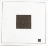
Position: Central elements have more weight than peripheral ones. However, small elements placed at the edges can counterbalance larger central ones
How to Design a Logo: Creating Balance Through Positioning
Depth: Elements that lead the eye deeper into the design create strong visual force.

How to Design a Logo: Creating Balance Through Depth
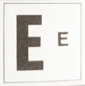
Size: Larger elements appear heavier.
How to Design a Logo: Creating Balance Through Size
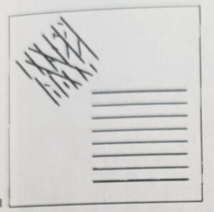
Texture: A small, highly textured element can balance a large, smooth element.
How to design a logo? Texture
Isolation: A shape that stands alone draws more attention than one surrounded by other elements.
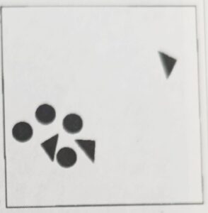
How to design a logo? Isolation
Main Subject: The focal point attracts attention and increases visual weight.
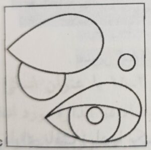
How to design a logo? Main topic
Contrast (Light & Dark): High contrast areas carry more visual weight.
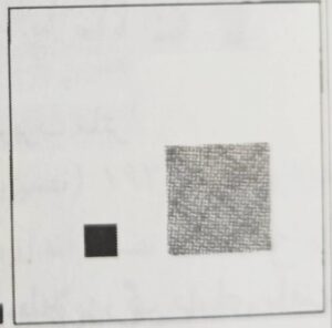
How to design a logo? Light and dark
Typography: Bold, dark text contrasts with light text, making pages easier to read.
Shape Complexity: Complex outlines appear heavier than simple ones.
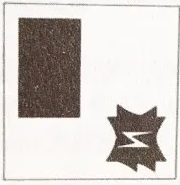
How to Design a Logo? | Creating Balance Through Shape
Structure: Even similar elements (e.g., letters) can have varying weight due to thickness and serifs.
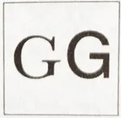
How to Design a Logo: Creating Balance Through Structure
Color: Brighter and more saturated colors appear heavier. A large muted shape can be balanced by a small, vibrant one.
5. Typography in Logo Design
For logo typography, especially in vector-based software like Illustrator, individual letters should be edited separately. To do this, select the text and use the Expand option under the Object menu. This converts the text into editable shapes, allowing for precise customization.
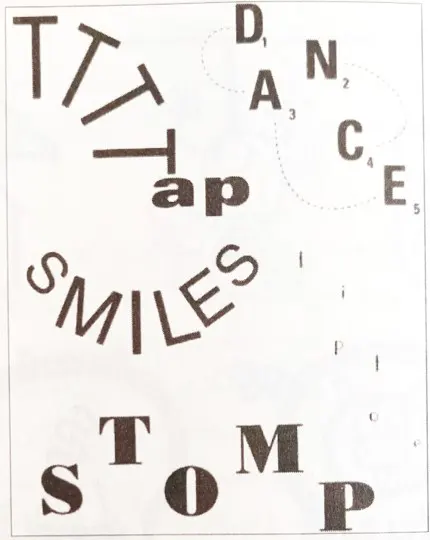
How to design a logo? Changing the letters in the logotype
Useful tools:
- Pencil Tool: For adjusting vector points.
- Scissors Tool: For cutting vector points and modifying shapes.
Final Note
For a deeper understanding of these concepts, we highly recommend purchasing and studying Fundamentals of Graphic Design. The insights shared here are just a small glimpse into the vast knowledge contained in this invaluable book.
Follow us on Instagram to stay updated with Wink Design’s latest work!

